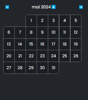
Day Reference
DayProps
children
Type: (props: DayInnerProps) => ReactNode
The callback that will be called to render each day in the calendar.
DayInnerProps
INFO
The props below are completely "optional", meaning you are free not to use them and to manipulate the api manually if needed (e.g. we provide a default alt prop but if you want to use another date format for example, you can just ignore it 👍)
onClick
Type: () => void
The default click handler for the day. Will update the date as well as doing some basic checks related to other features of the calendar like min/max range, etc...
isToday
Type: boolean
Is the day being rendered the actual today's date
isSelected
Type: boolean
Is the day being rendered the one that is already selected (after a user clicked it for example)
belongsToSelectedMonth
Type: boolean
Is the day being rendered in the month of today's date.
isOutOfRange
Type: boolean
Is the day being rendered outside of the min/max range provided.
isOverlapPlaceholder
Type: boolean
Is the day being rendered a "fake" day, useful to create the spacing needed if you don't want to render days outside of the current month with the no-overlap-with-offset offset mode
date
Type: Dayjs
The Dayjs date object, which you can use to extract the text to render in the cell
alt
Type: stringExample: dimanche 31 mars 2024
The default alt value to render on the button. The format lang is automatically adapted to your defined dayjs locale.
corners
Type: {topLeft: boolean, topRight: boolean, bottomLeft: boolean, bottomRight: boolean}
The object defining whether or not you should round a corner of the rendered day. This is pretty useful and easy to use when your design needs this.
The reason why you would want this instead of corning the first and last items of the first and last row is because with certain rendering mode, some items in the 2nd or before-to-last row might need to be corned too
